
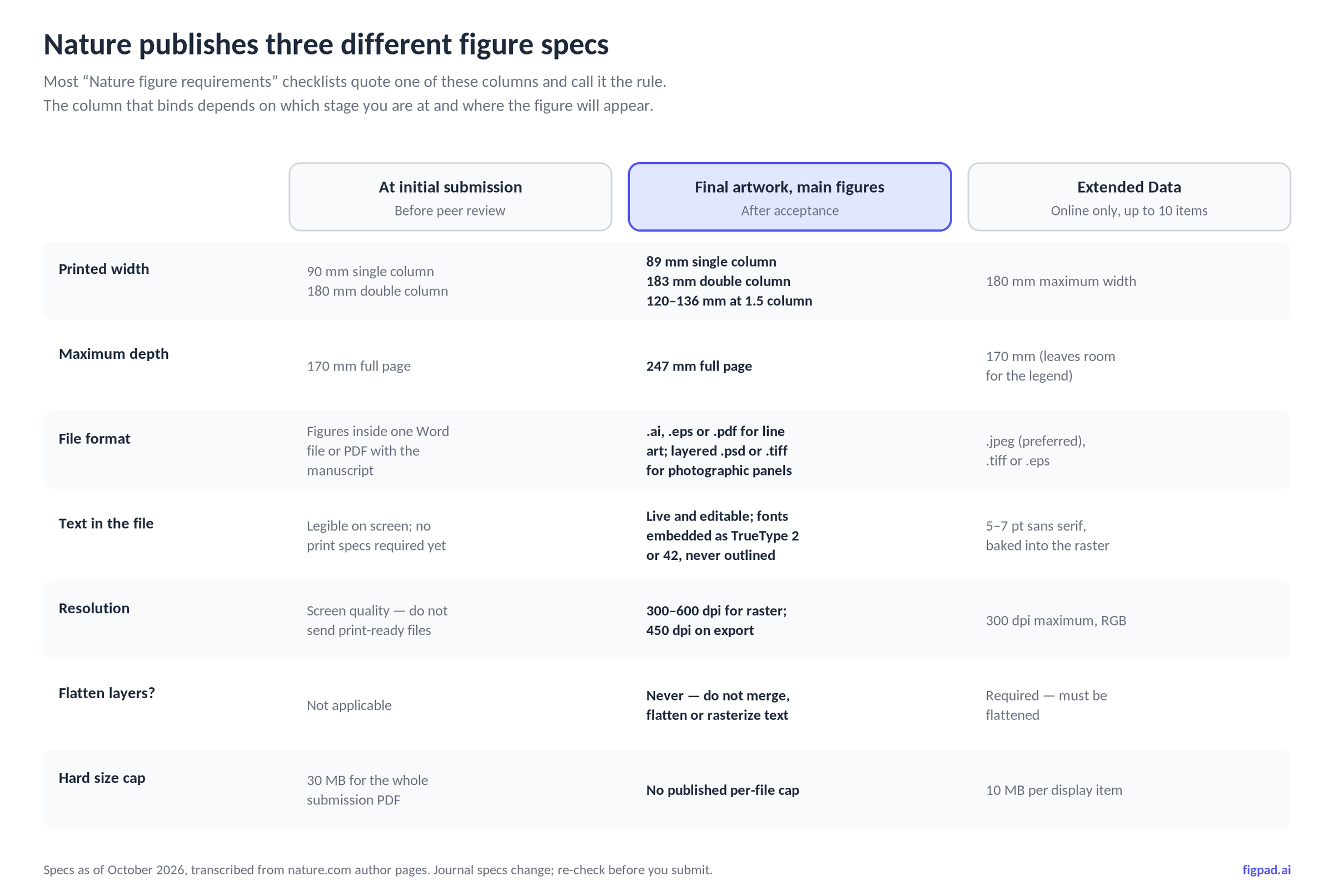
Nature does not publish one figure specification. It publishes three, and they disagree with each other on purpose. At initial submission you embed figures in a single Word file or PDF under 30 MB at roughly 90 mm or 180 mm wide. After acceptance, the production team wants final artwork at 89 mm single column, 183 mm double column, up to 247 mm deep, as vector .pdf, .eps or .ai for line art and layered .psd or .tiff for photographic panels at 300–600 dpi. Extended Data runs on the opposite rule: flattened .jpeg, RGB, 300 dpi maximum, under 10 MB, inside 180 × 170 mm. Across all three, text stays Arial or Helvetica at 5–7 pt, panel labels are 8 pt bold lowercase, and — the line that quietly rejects the most artwork — text must stay editable, never outlined.
The spec that applies to you depends on where you are in the process
Most checklists you will find for "Nature figure requirements" quote one column of numbers and present it as the rule. That is how people end up building a 300 dpi flattened PNG at 183 mm for a paper that has not been reviewed yet, or sending a flattened TIFF to production after acceptance and getting it bounced.
The three surfaces are genuinely different documents on nature.com, written for different moments:
- Initial submission. Nature explicitly tells you not to send print-publication quality figures at this stage. Figures go inside the manuscript Word file or PDF, up to 30 MB total. Widths quoted here are 90 mm single column and 180 mm double column, full page depth 170 mm.
- Final artwork, after acceptance. This is where the real numbers live: 89 mm single column, 183 mm double column, 120–136 mm for a column-and-a-half, and 247 mm full page depth.
- Extended Data. Online-only display items, up to ten of them, maximum 180 mm wide by 170 mm tall — the shorter depth leaves room for the legend on the page.
The millimetre discrepancies (90 vs 89, 180 vs 183, 170 vs 247) are not typos you should average out. They reflect a screen-stage spec and a print-production spec. If you build to 183 mm from day one you will be right at the end and harmlessly close at the start, which is the practical order of operations.
Fonts and line weights: the numbers are smaller than you think
Nature asks for a sans-serif typeface, "preferably Helvetica or Arial." Then it gets specific in a way that catches people who designed their figure at 200% zoom:
- Panel labels: 8 pt, bold, upright (not italic), lowercase —
a,b,c, notA,B,C. - All other text: 7 pt maximum, 5 pt minimum.
- Line weights: between 0.25 and 1 pt at final size. Anything thinner than 0.25 pt risks vanishing on press.
- Amino acid sequences: Courier or another monospaced font, one-letter code, in lines of 50 or 100 characters.
- Greek letters and glyphs: Symbol font.
The trap here is "at final size." A 7 pt label is 7 pt after the figure is scaled to 89 mm. If you build a schematic at 300 mm wide with 14 pt labels and then let the submission system shrink it, your text lands around 4 pt and falls under Nature's own minimum. Set your canvas to the real column width before you place a single label. It is a two-minute decision that prevents a full rebuild.
Resolution: 300, 450, or 600 — and when none of them apply
Three resolution numbers appear across Nature's pages, and they are not alternatives:
- 300 dpi is the floor for photographic images, measured at maximum usage size.
- 300–600 dpi is the working range for rasterised images in final artwork.
- 450 dpi is what Nature's figure guide asks for on export, noting that supplying at 450 dpi or above gives online proofs the highest resolution possible.
- 300 dpi maximum applies to Extended Data, which is capped rather than floored because the file must stay under 10 MB.
For pure line art — schematics, pathway diagrams, flow charts, plots — dpi is the wrong question entirely. Vector artwork has no resolution; it has coordinates. Nature prefers .pdf or .eps precisely so that a 0.25 pt stroke renders at whatever the press can resolve. If you are arguing with yourself about whether to export your mechanism diagram at 600 or 1200 dpi, the answer is that you should not be exporting it as pixels at all. Build it as vector in a scientific figure creator and export a raster only when a journal format forces one.
"All text needs to be legible and editable" is the requirement that actually bites
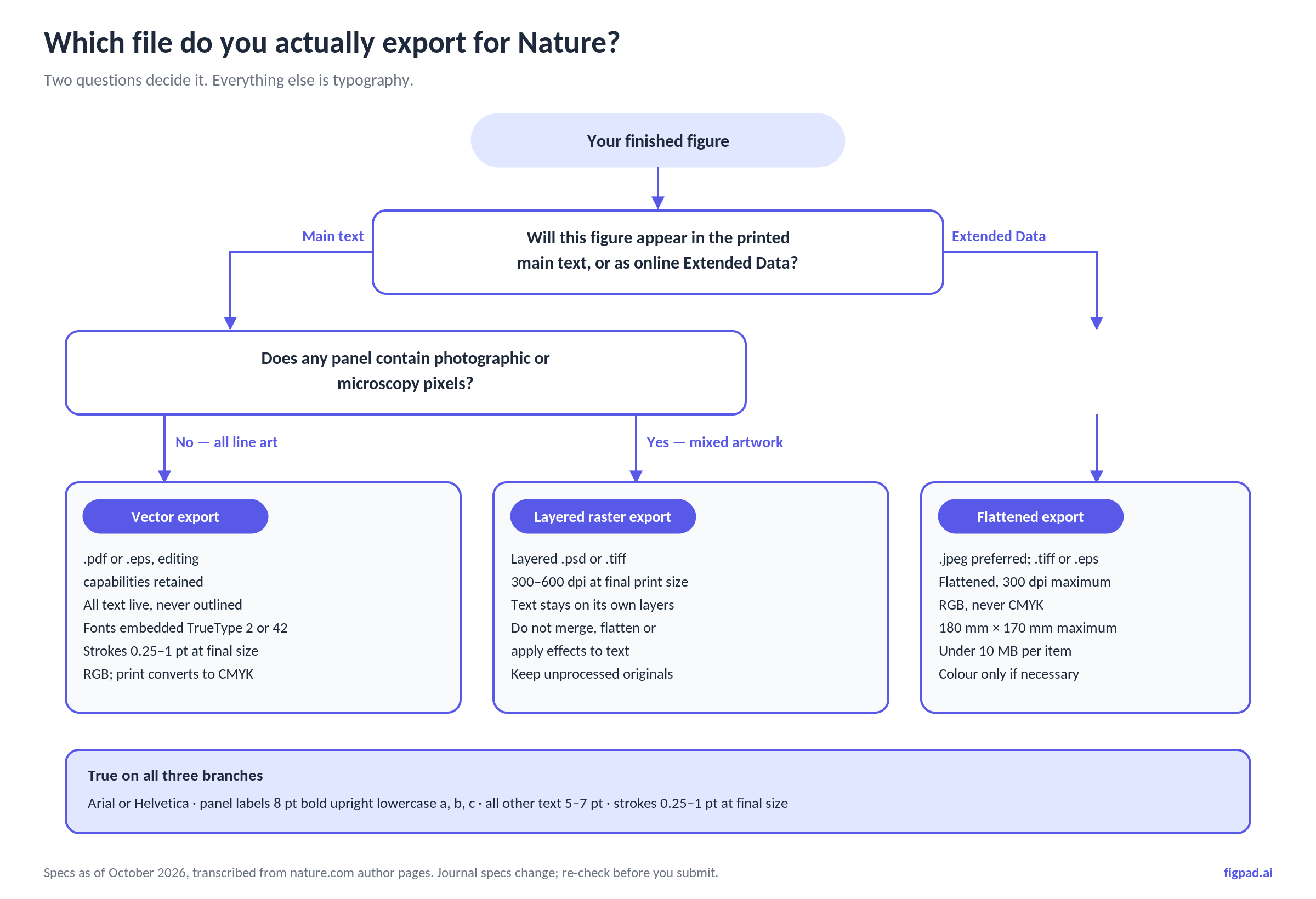
Buried in Nature's figure guide, and almost never quoted in the checklist posts, is the instruction that decides whether your artwork passes production: do not outline text. Nature wants fonts embedded as TrueType 2 or 42, explicitly not TrueType 3, and asks you to choose "retain all editing capabilities" when saving a PDF. For Photoshop files: do not merge layers, do not flatten, do not apply effects to text.
The reason is mechanical. Nature's production team routinely adjusts figures — resizing to column width, fixing a typo in a label, correcting a unit. If your text is live, that is a thirty-second edit. If you converted text to outlines or baked it into pixels, the only fix is to send it back to you, and you are now doing a revision round on artwork during proofs, with the clock running.
This is also the exact point where AI-generated figures fail. A model that outputs a flat PNG gives you an image of a figure, not a figure. The labels look like text and behave like a photograph of text. Nature's spec is indifferent to how beautiful it is.
Main figures and Extended Data follow opposite rules
This is the single most common production error, and it is counterintuitive enough to deserve its own table.
| Requirement | Final main figures | Extended Data |
|---|---|---|
| Flattening | Never — "do not rasterize line art or text" | Required — must be flattened |
| Preferred format | .ai, .eps, .pdf (line art); layered .psd/.tiff (photographic) |
.jpeg preferred, .tiff or .eps accepted |
| Resolution | 300–600 dpi raster; 450 dpi on export | 300 dpi maximum |
| Colour mode | RGB preferred; print converts to CMYK | RGB, never CMYK |
| Maximum size | 183 mm wide × 247 mm deep | 180 mm wide × 170 mm tall |
| File size | No published per-file cap | 10 MB per display item |
| Count | Typically 4 display items for a 6-page article, 5–6 for 8 pages | Up to 10 items |
| Legends | Fewer than 300 words each | Fit on the same page as the figure |
Specs as of October 2026, transcribed from Nature's author pages. Journal specifications change; we re-check monthly.
Two practical consequences. First, keep one editable master per figure and export two different children from it — do not try to make a single file satisfy both columns. Second, "colour should be avoided unless scientifically necessary" in Extended Data is a real editorial preference, not boilerplate; decorative colour in a supplementary panel reads as noise.
What Nature says about AI-generated images — read this before you use any AI tool
We sell an AI figure tool, so we will be blunt rather than convenient. Nature has stated it will not publish "any content in which photography, videos or illustrations have been created wholly or partly using generative AI," outside of articles specifically about AI. Its reasoning is attribution, consent, and the provenance of training data, not aesthetics. Nature Portfolio's broader AI policy likewise lists creating photorealistic images (deepfakes) among its "not permitted" uses.
That is a stricter position than most publishers hold, and it is stated plainly. So:
- Do not submit an AI-generated illustration to a Nature journal as final artwork and assume the policy is about photographs only. The wording covers illustrations.
- Do check your specific target journal. Policies differ substantially across publishers and are being revised frequently in 2026.
- Do disclose AI assistance where a journal asks for it, and never present a generated figure as primary experimental data. Image integrity rules still apply in full: processing must be applied equally across the whole image, cloning and healing tools are unacceptable, and life science papers require unprocessed originals of gels and blots.
Where AI tooling is genuinely defensible across venues is in the work around the final artwork — drafting a layout you then verify and rebuild, converting your own existing figure into an editable vector you control, reformatting a figure you drew to another journal's column width. Where it is not defensible is generating a scientific claim as a picture.
How FigPad fits
FigPad exists because of the editability requirement above, not because flat images are hard to produce. Prompt, sketch, or a reference image goes in; a structured, layered draft comes out on a canvas where every label, arrow, and shape is a separate object you can select and change.
That maps onto Nature's spec in three places. Layered SVG export (available on every plan, including free) gives you true vector paths where text is still text — open it in Illustrator or Inkscape, set your column width to 183 mm, and adjust type to 7 pt without re-tracing anything. PPTX export puts the same figure into slides as editable objects for the lab meeting where someone inevitably questions a label. PNG and JPG, downloaded at the resolution the model generates, cover the raster cases, including Extended Data where flattening is what Nature actually wants; check the pixel width against Nature's column widths before you rely on one.
The editing economics matter when a reviewer asks for a change. One generation costs 2 credits, a text fix costs 2, editing elements directly on the canvas is free, and exporting an editable SVG costs 4 credits with re-exports of the same version free — so a full generate–revise–export loop runs about 16 credits. Plans start at $12/month billed yearly; Plus is $20/month billed yearly or $29 month-to-month, Pro is $29/month billed yearly or $49 month-to-month, and one-time credit packs start at $12 for 95 credits that never expire (prices checked 2026-11-02). The full breakdown is on the pricing page, and the AI scientific figure generator page shows the editable output on real examples. If you are starting from a sketch or an existing bitmap, the tutorials cover the vectorizer path.
When FigPad is the wrong tool for a Nature figure
Three cases, stated honestly:
- Your figure is the data. Micrographs, gels, blots, flow cytometry plots, spectra — anything that is evidence rather than explanation must come from your instrument and your analysis software, processed only in ways Nature's image integrity policy permits. No generative tool belongs anywhere near it.
- Your target is a Nature journal and the figure is an illustration. Given the policy quoted above, the conservative path is to treat AI output as a draft you rebuild, or to ask the editorial office directly before you rely on it. Do not let a deadline make that decision for you.
- You need a canonical icon set with exact institutional conventions. If your field has a standardised visual vocabulary and your lab already works in a library-based tool, the assembly-by-hand route still produces the most defensible figures. FigPad is faster at getting from nothing to a structured draft; it is not a substitute for domain-specific iconographic standards.
Key Takeaways
- Build to 183 mm double column / 89 mm single column, 247 mm maximum depth — the final-artwork numbers — from the start, and your initial submission will also be fine.
- Set type at 5–7 pt Arial or Helvetica with 8 pt bold lowercase panel labels, at final size, not at the size you are comfortable editing.
- Never outline or flatten text in main figures; embed fonts as TrueType 2 or 42 and save PDFs with editing capabilities retained.
- Extended Data inverts the rules: flattened
.jpeg, RGB, 300 dpi maximum, under 10 MB, inside 180 × 170 mm. - Nature states it will not publish illustrations created wholly or partly with generative AI — check your target journal's policy before you build, and keep AI in the drafting and reformatting layer rather than the final-artwork layer.
